
BERRY &
BLOOM
Berry picking is all about fun, and the orchard's website should match the vibe.
TIMELINE
9 weeks
ROLE
UX/UI Designer
TOOLS
Figma, Figjam, Illustrator
what was the problem?
To understand the experience from both sides: visitors and farmers, I started by researching existing fruit picking orchards and farms, and how they communicate seasonal availability, manage bookings, and promote events. I also wanted to uncover what matters most to farm owners and what visitors expect when planning a visit.
For this, I used secondary research methods, exploring social media, blog posts, and online forums, to identify common frustrations, expectations, and improvement opportunities.
research goals

Farmers
Because fruit is only available for a short season, farms struggle to attract visitors year-round and often need extra activities or events to maintain interest.
Many farms rely heavily on a small, local community of visitors. Attracting new visitors is a challenge.
A common frustration for farmers is visitors not understanding how these farms work, especially when it comes to picking and paying policies, or general farm etiquette.

Visitors
Many users struggle to find clear, up-to-date information on farm websites. Details like which fruits are currently available, farm size, dog policies, or even how to get there are often missing.
Not having an online booking system can be frustrating. When farms manage bookings manually, users with busy schedules often struggle to find a suitable time that works for both sides.
Users also form first impressions based on visuals. When a website looks outdated or poorly designed, they often assume the same about the farm itself and lose interest in visiting.
In this stage, I focused on identifying the main problem to be solved, and aligning it with users’ needs. I created personas and mapped their current journey to understand what challenges they face and how the design could better support them.
From my research, I noticed a pattern amongst all opinions. New users who were interested in spending a day at a farm but felt unsure about the whole experience, and didn't feel confident by the information provided online. Most of them were planning group visits with friends or family, and booking a new experience that you've never tried before, for a group of people is quite a big responsibility. This observation helped me come up with personas that reflect these users and their needs.


I mapped Rohan’s journey from the moment he decides to visit a farm to finally booking the trip. This helped me see what users go through, what excites them, and where the experience could be made more delightful.

pain points
What's in Season?
Users can’t easily find what’s in season, how fruit picking works, whether the farm is dog-friendly, or what activities are available.
No Online Booking
Many farm websites still rely on phone calls for bookings, which isn’t convenient for busy users who expect quick, online options.
Unappealing Visuals
Outdated or poor-quality images make users question if the farm is worth visiting.
problem statement
Our users have the problem of wanting to plan a stress-free day out on a fruit farm with family or friends, but often struggle to find clear information and book ahead without spending extra time searching or calling for details. Our solution should deliver a way to create an online journey that guides them through booking and gives them confidence about what to expect on the day at the farm.
Once I defined the main problem, it was time to get creative. I started by thinking of different questions to spark new ideas and directions. From there, I brainstormed different ways users could explore and book their visit, mapped out the sitemap, and turned the ideas into quick wireframes and prototypes to see how they might come to life.
To focus on the main problem, I started by asking myself a bunch of smaller questions. I then combined them into one main question that guided my brainstorming and helped me stay focused whenever I got lost among different ideas.

How might we create an engaging experience that inspires users to book a visit to the fruit farm?
In the Define phase, I found that one of the main issues with existing orchard websites was how difficult it was for users to find clear information. To fix this, I needed a simple and intuitive information structure. I ran a card-sorting test with 2 participants to see how they naturally grouped content and what labels made the most sense.
I also used the crazy 8s method to sketch multiple homepage layouts, focusing on creating a strong first impression.
My goal was to design a website that encourages visitors to explore more, especially the fruit availability section, since that’s what drives most users’ decisions to visit.


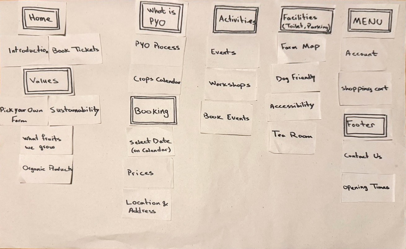
The website structure consists of two main different forms: It uses a hierarchical structure for the main navigation, allowing users to easily explore key sections through the top menu and homepage links, and a sequential structure for the booking flow, guiding users step by step from booking details to payment and confirmation.

My lo-fi prototype served as the foundation for visualizing the app's structure and user flow. They helped map out key features, prioritize functionality, and ensure a smooth navigation experience before moving to high-fidelity designs.

To understand how users interacted with my design, I ran an unmoderated usability test on the Lo-Fi prototype. I wanted to see whether they could easily find key information and move through the booking flow without confusion. This step helped me catch issues early and shape the next stage of the design.

usability testing
To conduct the unmoderated test, I shared the Figma prototype with 2 participants along with a set of tasks focused on the website’s main user flows. After each task, I asked follow-up questions to understand how each step felt to them, what stood out, and what caused confusion.
Task 1:
Imagine you’re planning your first visit to the farm. Find information about how to get there, including opening hours, directions, or transport options.
Task 2:
You’ve heard the farm is hosting an event this month and you’d like to know more. Find detailed information about the event.
Task 3:
You’re interested in visiting the farm in June and want to know what fruits will be in season. Find the desired information.
Task 4:
You’ve decided to visit the farm with a friend on July 17th. Go through the process of booking a visit.
insights & iterations
After reviewing the results from the usability test, I identified areas where users felt confused or struggled to complete tasks. Below are the key insights from feedbacks and the design updates made to improve the experience.
Insight 1:
Participants felt confused and unsure where to look for visiting information.
Iteration:
Irrelevant items (calendar, facilities, accessibility) were moved to other sections.
The layout of the tabbed table was changed for a better navigation experience.
The section's name was updated to use simpler, more intuitive language.

Insight 2:
Participants found the booking page crowded and expected the calendar to be part of the booking flow.
Iteration:
The form was split into two steps: personal details input and payment details input, and a progress bar was added to guide users through the process.
The calendar was moved into the booking form for a smoother flow.
Event capacity with available spots is now shown based on the selected date.

Insight 3:
Participants mentioned that event cards were missing key details, and the design felt outdated.
Iteration:
The price and date were added directly to the event cards.
The "Read More" button was removed as users naturally clicked the cards without needing a separate prompt.

One of the biggest challenges was designing a website that feels warm and playful without compromising clarity or usability. I didn’t want the design to feel too traditional or outdated, so I looked for ways to bring a fresh and creative design to a familiar type of business.
Challenge 01
Engaging Design
I experimented with bold red and green colors that remind users of a berry farm, playful fonts, and illustrations to make the website feel inviting while staying easy to navigate. I created an interactive fruit calendar where users can scroll through the months to discover what’s in season throughout the year. To show real photos of the farm, I added an Instagram section at the bottom of each page. It keeps the site feeling up-to-date, and encourages users to explore the farm’s social media.
Challenge 02
Booking Flow
Many users found booking confusing, so I wanted to make it feel as easy as possible. I created a clear Visit Details section and simplified the flow into clear steps, helping users move through the process confidently and without frustration.
Challenge 03
Fruit Picking Process
First-time visitors often felt unsure about what to expect. To help, I designed a friendly visual guide that walks them through how pick-your-own works.
Challenge 04
Farm Activities
Fruit picking is only available during part of the year, but farms usually offer other experiences beyond the harvest season. I designed an Activities section to highlight seasonal events, workshops, and other farm experiences. It gives visitors new reasons to return, even when fruit picking isn’t available.
Mockups


Responsive mockups: Activities Hero Section, and Visit Details Section (left to right)

Main Screen Mockups: Homepage, Plan Your Visit, Activities, and Activity Details (left to right)
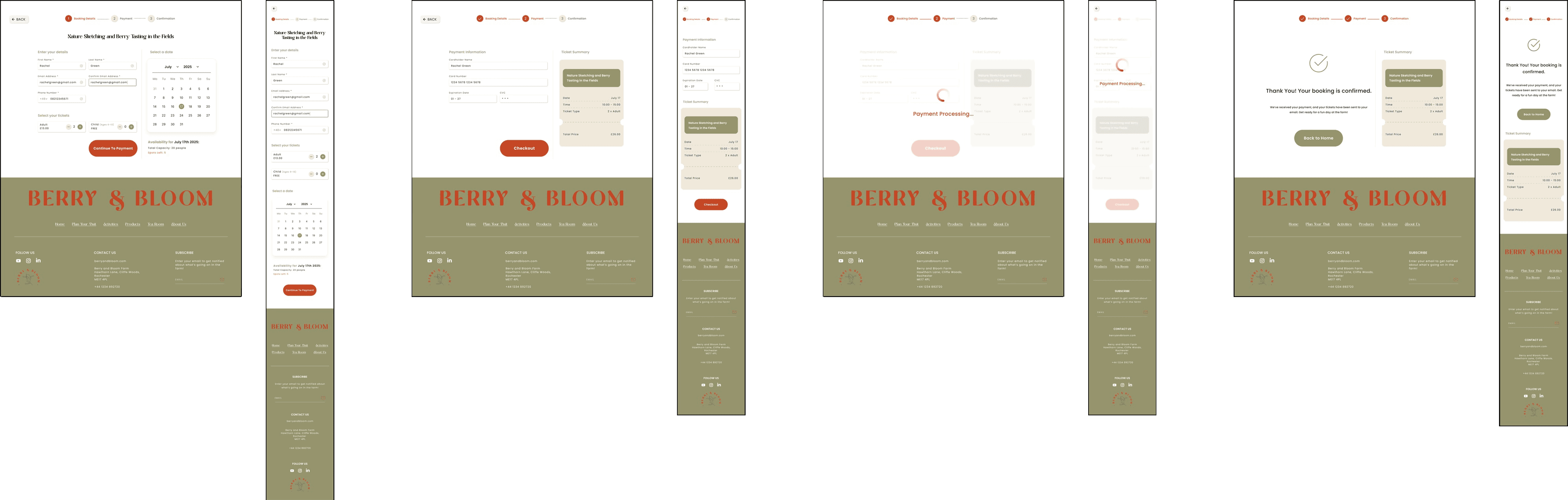
Booking Process: Personal Details, Payment Details, Processing, and Booking Confirmation (left to right)
Design guide

One of my main goals was to make the experience more fun and engaging, something that wasn’t fully achieved without interactivity. So, I started creating experimenting with microinteractions in Figma. This process not only made the website feel more dynamic but also helped me improve my Figma skills.
One of the biggest challenges in this project was figuring out how to make the website feel fun and inviting while still maintaining usability and readability for users looking for practical information.
Another challenge was the research phase. Since I didn’t have access to real farm owners or visitors, it was harder to collect direct feedback. Instead, I relied on secondary research, including online reviews, forums, and competitor websites, to understand what users might need or expect. If I had more time or access to real users, I would have loved to conduct interviews and usability tests to further refine the design.
Next Steps
Design Additional Pages
Design pages for the farm shop, tea room, and About Us section.
Enhance Payment Flow
Improve the checkout process by offering more payment options and enabling features like saving card details.
Conduct Further User Testing
Test updated designs with more users to uncover new usability issues and refine the experience based on direct feedback.
Support Real-Time Updates
Implement a system for urgent announcements, such as weather-related closures, to keep visitors informed.
Improve Navigation Support
Add direct links to Google Maps to help users easily locate the farm and plan their route.
Manage Expectations During Peak Times
Provide information about wait times or capacity limits.
Promote Health and Safety Awareness
Add important health and safety information, including hygiene guidelines, allergy risks (e.g., bees, nuts), and food safety notices.
Reduce Administrative Burden
Include an FAQ section or chatbot to handle common queries and reduce the volume of direct enquiries.
Improve Accessibility
Add alt text to all images, use clear and descriptive labels for form fields and buttons, offer a “reduce animations” toggle, and test the site with screen readers to ensure a fully accessible experience.
