
Donora
An online space that connects people with the causes that move their hearts.
TIMELINE
10 weeks
ROLE
UX/UI Designer
TOOLS
Figma, Figjam, Illustrator, Google Forms
Project Overview
To understand the key challenges of the product I was designing, I first needed to explore how people currently donate and what existing platforms offer. I conducted user interviews to learn about people’s donation habits, motivations, and pain points, complemented by secondary research to uncover trends and common challenges in the UK charity sector. I also performed a competitive audit to gain a deeper understanding of similar platforms and identify opportunities for improvement.
research goals
I created an online survey and shared it with 10 participants aged between 17 and 42, who had donated to charities before. The goal was to learn about their donation habits. The responses revealed key insights, shaping ideas to make donating simpler, more personal, and more accessible.

I reviewed reports on UK donation trends. I found that among younger users, the main reason for not donating is affordability, while older users (55+) are more concerned about trust.

Main reasons for not donating to charity in the last 12 months (2025)
By identifying users’ motivations, barriers, trust builders, information gaps, and usability issues, I identified key needs that guided the design decisions.

I conducted a competitive analysis of four charity and fundraising platforms: GoFundMe, JustGiving, Charity Navigator, and Givey. I evaluated their user experience across five key stages: Homepage, Search, Find Charities, Charity Page, and Donate. I created a list of strengths and weaknesses to evaluate what worked well and what could be improved.
Then, I summarised my findings in a table focusing on overall functionality and two main aspects I was most curious about: how platforms build user trust and how they keep users engaged over time.


In the Define stage I turned my research insights into a clearer picture of the users and their needs. I created personas to represent the main user groups, mapped their journeys to see where they struggle, and outlined key pain points that shape their donation experience. These insights helped me focus on what really needs solving in the next steps.
The interviews revealed two main donor profiles. Younger users often struggle to connect with causes or feel limited by their budget, while older users are more hesitant to donate due to a lack of trust in lesser-known organisations. I created my personas to capture and represent these key characteristics.


I created this user journey map to to identify barriers and drop-off points in the donation process. It follows a typical user exploring the app, browsing causes, and attempting to donate. Initial interest often turns into hesitation due to trust concerns, and at the donation stage, limited affordability options cause frustration, leading users to abandon the process.

pain points
Feeling Financially Limited
Many users feel that small donations won’t make a real difference. Others feel excluded from giving altogether because of limited funds.
Lack of Trust & Transparency
Users hesitate to donate to unfamiliar charities due to uncertainty about where the money goes. They also feel disconnected after donating when there’s little follow-up or visible impact.
Weak Emotional Connection
Many younger donors struggle to find causes they personally relate to. Without a strong emotional connection, they’re less likely to donate.
In the Ideate phase, I started by turning the main problems into different questions to narrow down what to focus on. Then I created user flows to map the key steps. From there, I explored ideas by creating lo-fi wireframes to quickly test different solution directions.
How Might We?
To focus on the main problem, I started by asking myself a bunch of questions. I then combined them into one main question that guided my brainstorming and helped me stay focused whenever I got lost among different ideas.

How might we make donating easier and more personal so users can find causes they care about, trust the charities behind them, and clearly understand the impact of their donations?
I created two main user flows to capture the key actions users take on the platform. The first flow shows how users browse and discover charities, and the second flow focuses on the each step of the donation process.
01 Charity Discovery Flow:

02 Donation Flow:

After defining the website’s user flow, I began ideating lo-fi wireframes and prototypes. These wireframes helped me map out key features, interactions, navigation, and overall layout.

To evaluate my low-fidelity prototype, I ran a usability test to see how easily users could complete key actions when making a donation. The insights helped me refine the experience and make the overall flow feel smoother and more natural.
usability testing
To evaluate the usability of my lo-fi prototype, I conducted an unmoderated usability test with 5 users. Participants were asked to complete 6 tasks, followed by questions after each task to gain deeper insights into their thought process. The goal of the test was to evaluate whether users could easily complete key actions typically taken in order to make a donation.
Task 1:
You're interested in supporting a charity focused on Health & Medical. Browse through the list of related fundraisers and select one to view.
Task 2:
Imagine you’re curious about how the charity you've found is using donations. Find and read how they use funds.
Task 3:
You’ve found the charity you like. Try to make a one-time donation of £5.
Task 4:
You’ve already donated to a charity and want to check if they’ve shared any recent updates or stories. Find and read about the last update on what they’ve been doing.
Task 5:
Imagine you'd like to browse all the different types of charities available before deciding. Try to find a full list of charity categories on the platform.
Task 6:
Find charities or fundraisers that are marked as urgent or in immediate need of support.
Test insights
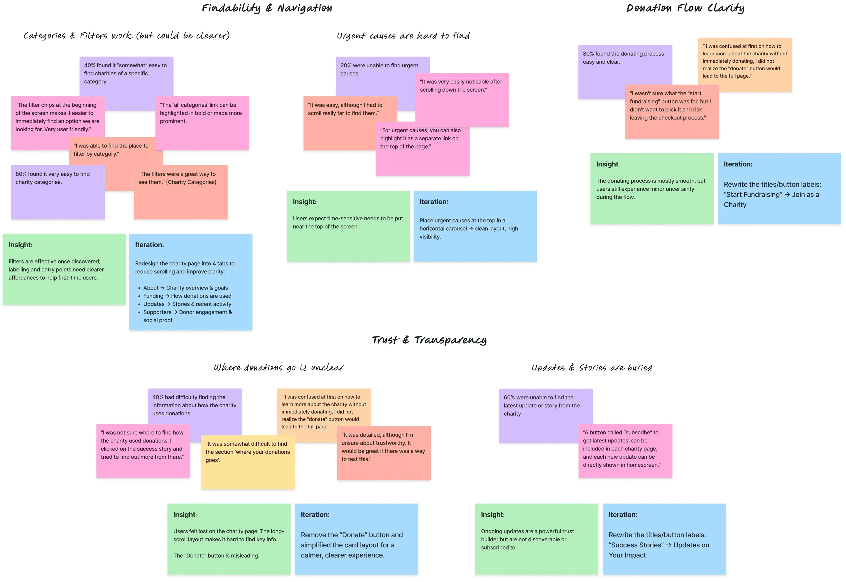
After reviewing the usability test results, I noticed a few areas where users felt unsure or struggled to complete tasks. The main issue was lack of transparency. The long charity page with too much scrolling made it hard to find different pieces of information, so I divided it into four main tabs to make navigation easier. Users also had trouble spotting urgent causes, so I added a dedicated section for them at the top of the homepage. Another important change was labelling. I worked on making the wording clearer and easier to understand.
Below is my process of analysing the test results, identifying key insights, and brainstorming solutions to improve the experience.
iterations
Below are a few examples showing how I changed my designs and moved from lo-fi wireframes to hi-fi designs after testing, gathering insights, and iterating based on what I learned.
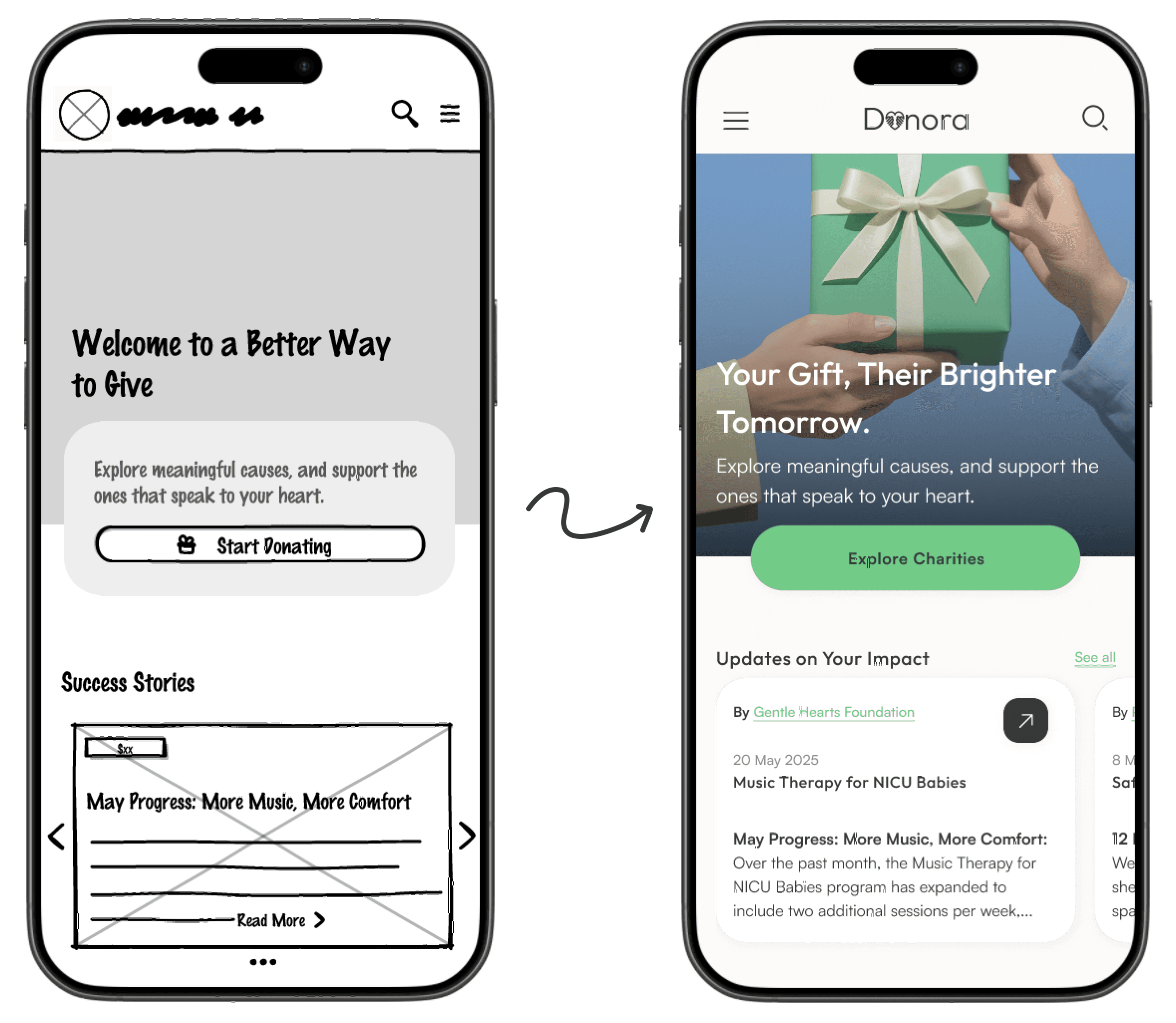

After applying changes based on insights and iterations, I moved on to the Hi-Fi wireframes by adding visual elements to the design. Since the website relies heavily on images, I kept the overall design minimal to let the charity cards stand out and avoid overwhelming users with cluttered layouts or excessive details. The colour palette remained simple, with green as the primary tone, symbolising generosity and trust.
High Fidelity Prototypes
Mockups


Design guide

*Icons & Illustrations created by Anggara Putra from Noun Project
One of the biggest challenges in this project was designing a user experience that feels trustworthy and emotionally engaging. I wanted the design to reflect the heart and purpose behind each charity, without overwhelming users with too much information or making the process feel complicated.
I practiced ways to build trust through transparency by providing all the key information users want before donating. To keep users engaged and help turn one-time donors into repeat supporters, I focused on adding gamification features and allowing users to customize the experience based on their interests.
Next Steps
Usability Testing
Conduct usability testing on the high-fidelity prototype to uncover areas for improvement.
Social Interaction
Introduce social interactivity features such as following users or organizations to build a sense of community.
Improve Charity Updates
Add a charity updates feature, allowing users to receive news from selected organizations even without donating.
Sharing Charities
Design the full sharing experience to make it easy and meaningful for users to share their support for a cause.
Page Expansion
Design the additional pages linked from the main menu and footer.
Bookmarks Section
Design the bookmarks section to show users' favourite charities or causes.
Emotional Design Research
Research further and apply UI/UX patterns that encourage generosity and emotional connection.
Build More Trust
Add trust-building elements such as charity ratings.
